Inspired by their love of the 80s-90s, the owners of a new discotheque wanted to evoke flashbacks and nostalgia for the era. After approaching IP Design for a logo, it became clear the key challenge for the business was the target demographic - people aged 20 - 40 who had few, if any, memories of the time.
A logo wasn't enough to position the disco firmly within the cutthroat Quebec nightclub scene and we recommended a full brand strategy to embed Midnight Blue firmly within the marketplace.
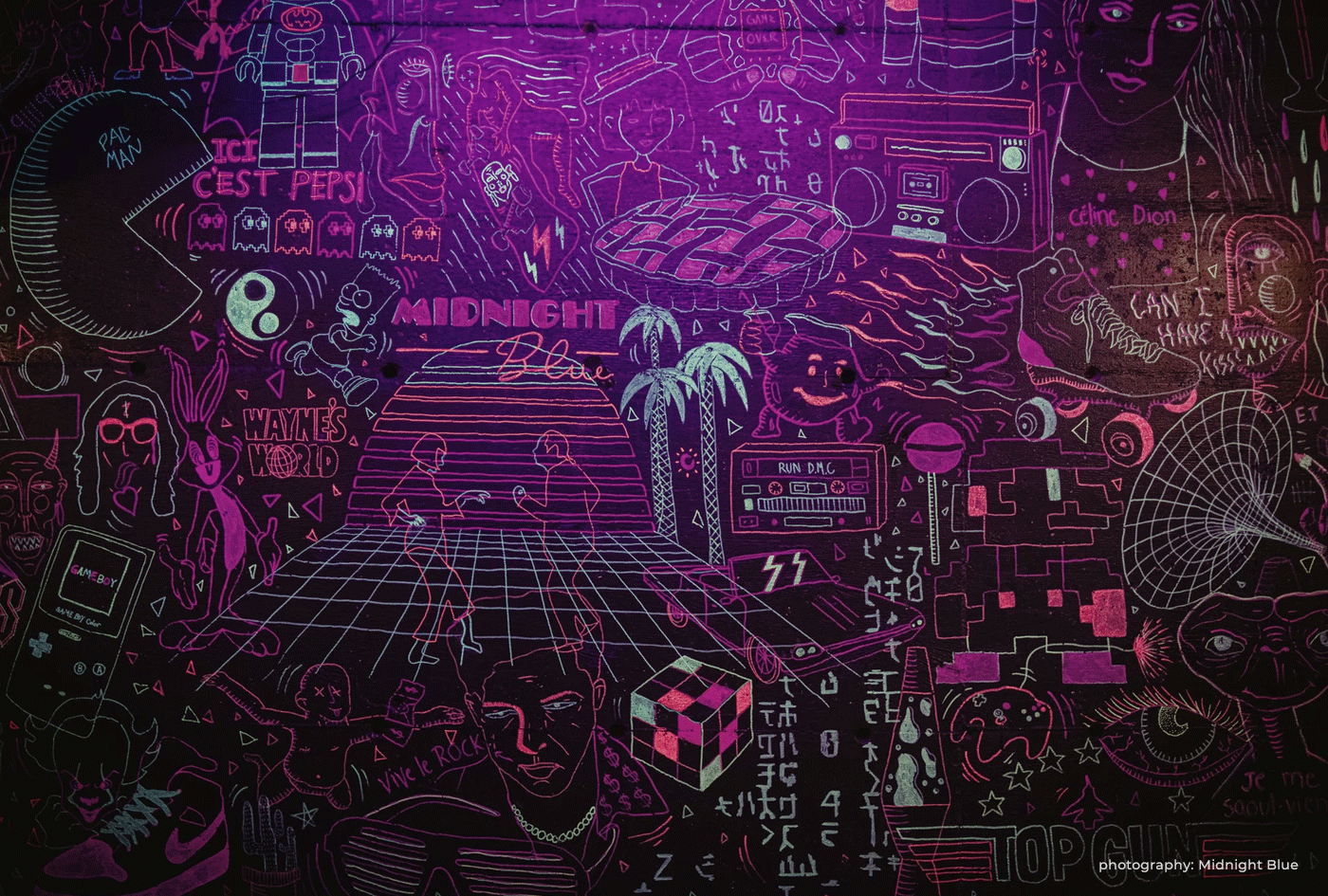
Through brand concept exploration we were able to define the goal of the discotheque, to revive and relive those years by sharing the culture with a new generation.
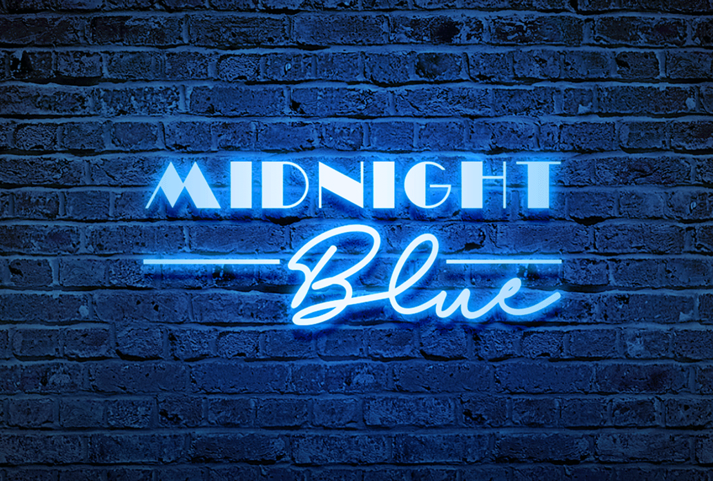
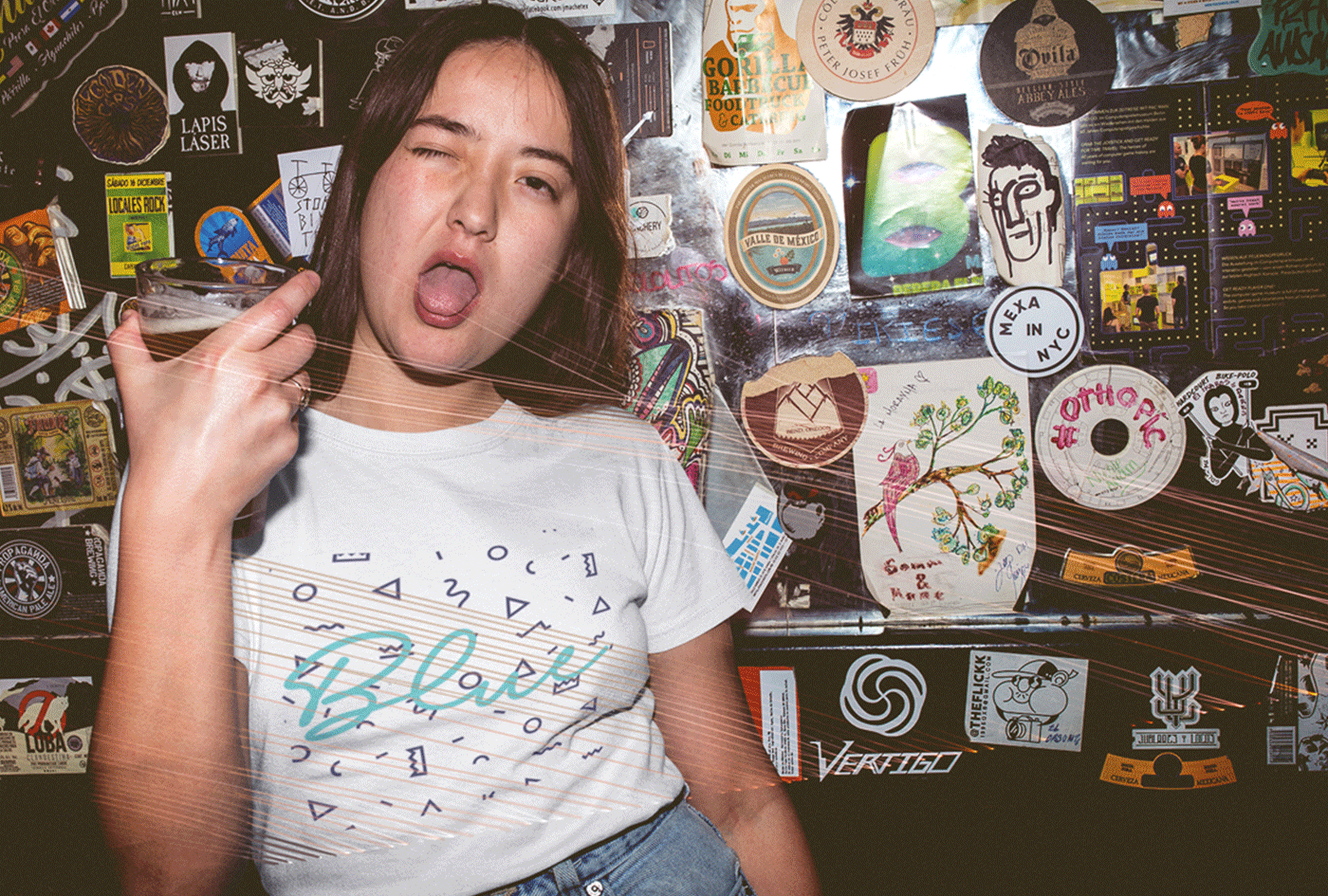
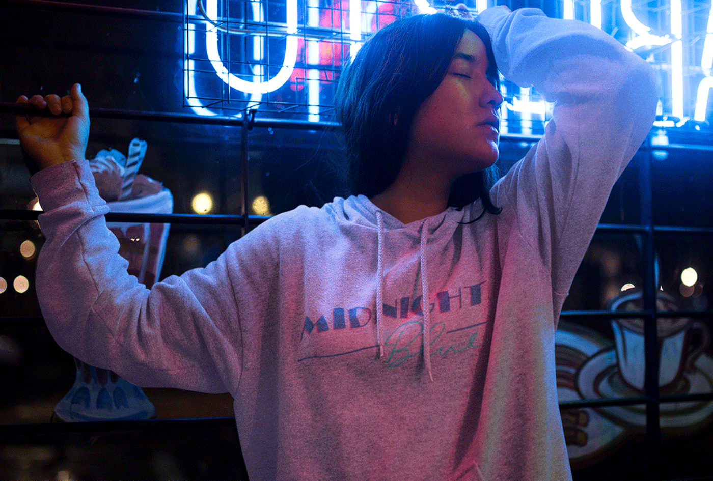
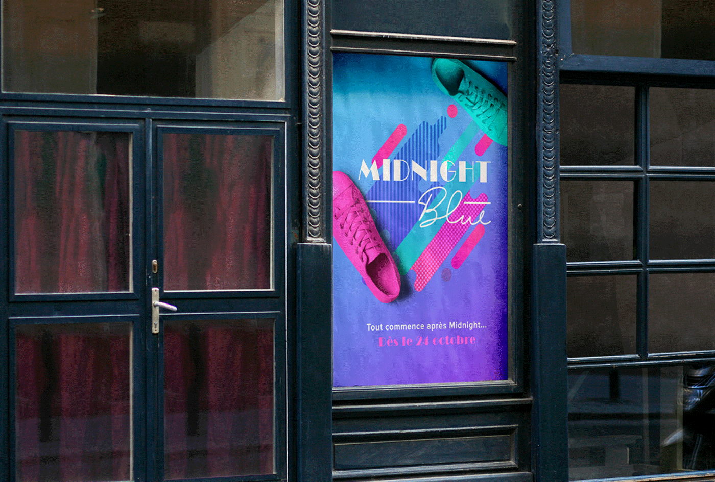
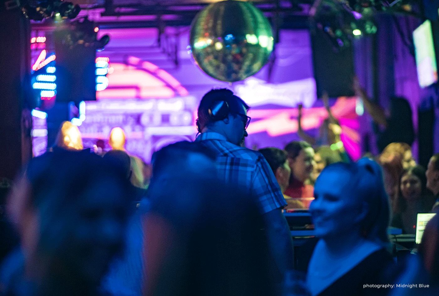
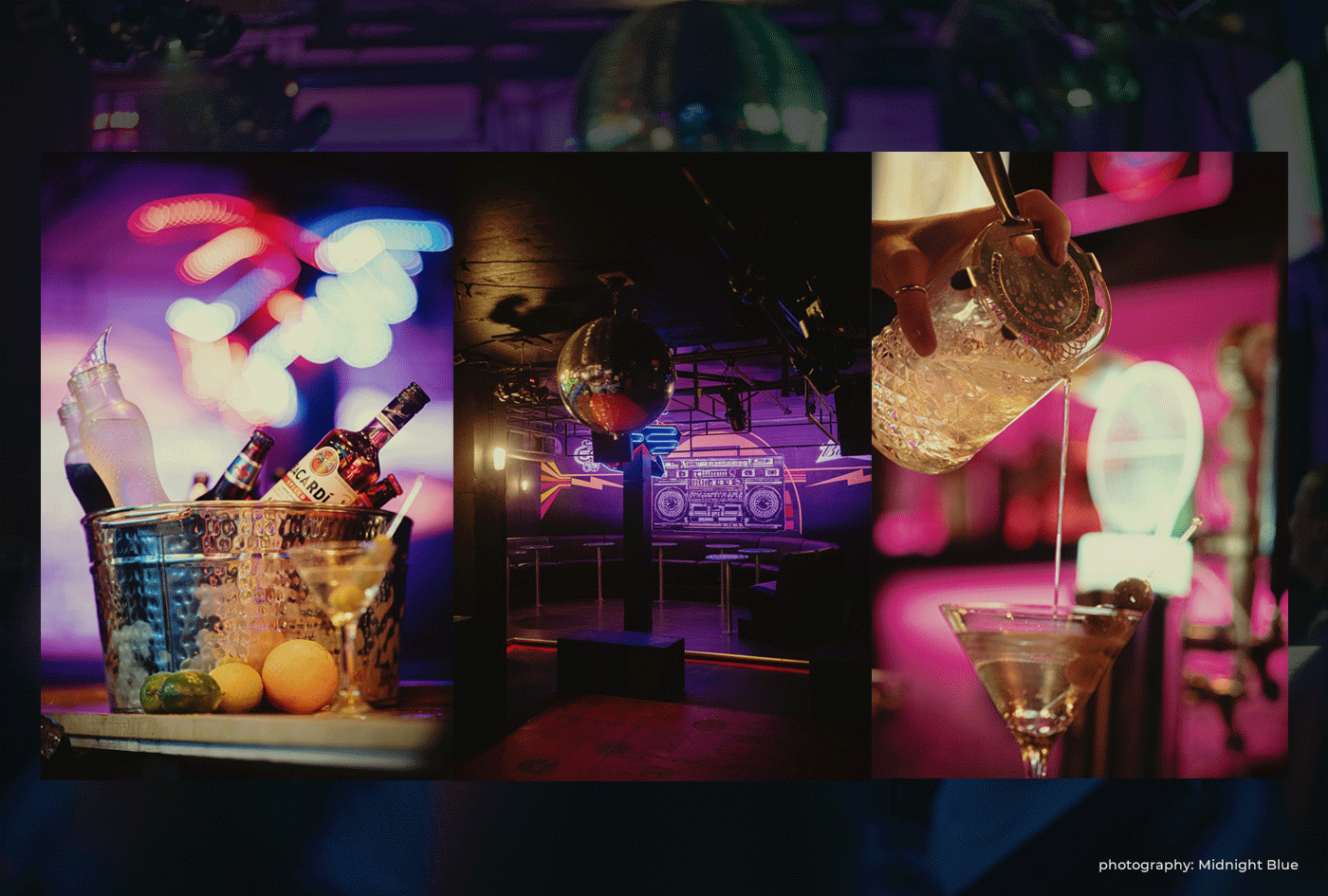
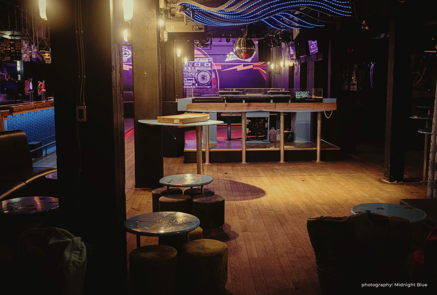
Our research was painstaking and through constant questioning, we finalized the brand identity. Neon pink with accents of blue permeates the young and lively brand. Unique decor, like cassette tapes, embodies the spirit of the era while more modern twists keep it engaging for everyone.
The popular discotheque is often packed to the rafters with lively patrons making new memories, while surrounded by the vibes from a bygone era.
We created the bar's unforgettable spirit. Setting the bar, for the bar, by building the brand.
Nancy Lacharité | Midnight Blue
Notre expérience fut très agréable. Il était toujours très facile de se parler pour apporter des modifications. Nous avons aussi apprécié la rapidité avec laquelle nous avons eu nos échantillons et notre logo final.
Simon Légaré | Midnight Blue Client
Le plus beau club que j’ai vu depuis longtemps à Québec. Le fait de pouvoir changer d’ambiance au courant de la soirée, c’est vraiment cool!